8th-14th January Weekly Update
At the start of the week, we were told to complete a few tutorials to help gain experience using Photopea.
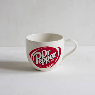
The first video I looked at was wrapping a logo onto a coffee mug. I chose Dr. Pepper logo and searched on google images to look for a simple coffee cup.
The next video I looked at was creating a 'fire' effect on text. It was the coolest out of the ones I did and the most technical out of them all.
I started with simple large text spelling the word fire, I then used a distortion tool with a subcategory called 'ripple'.
Then when it come down to the text colour, I made it a nice vibrant orange as highlighting would come right after making it look really nice compared to just the word 'fire' with the ripple effect added.
Lastly, the easiest one, was a video showing how to bend text.
It was fairly simple with Photopea having a warp text tool that allows you to chose a way the text is warped.
I chose a banana and the word 'banana' to make it as simple as possible.
Before:


.jpg)
.jpg)


.jpg)


Comments
Post a Comment